Minimalist Ads: 30 Facebook & Instagram Examples That Ran
Checked 25 Oct 2026 · 30 ads from 30 brands, from Meta's Ad Library · How we pick ads
With almost nothing on the picture, the product has to look good enough to sell itself, and the explaining moves into the caption. Across the 30 ads, one from each of 30 brands, the picture stays quiet while the caption carries specs, proof and offers, and 40% of the set is jewelry and accessories. The shortest run was 109 days.
- 77%studio shots with the product on show
- 40%of the ads sell jewelry or accessories
- 10%lead with a discount or free kit on the picture
- 167+days, the median run
Where the empty space goes
Grouped by the job each ad does. Swipe a row, and tap “Why it works” for our breakdown.
Hardware floating at an angle · 5
With nothing under it, a gadget or shoe reads as a designed object. Keychron and Marshall Headphones use the tilt to make a mass-produced item look rendered, not shelved.
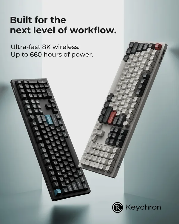
“Built for the next level of workflow.”
Why it works
A dark keyboard and a light one float at steep angles against a pale gradient, with a headline at top left and no price or button on the picture. The specs are held to two lines: "Ultra-fast 8K wireless." and "Up to 660 hours of power." Hardware buyers compare numbers, so the ad hands them a pair and leaves the rest to the caption. Angled this way, both boards read as designed objects instead of catalog shots.
Started 30 Mar 2026. Live when checked on 25 Oct 2026. View in Meta Ad Library ↗
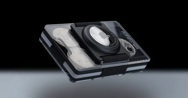
“Build for Individualists”
Why it works
The wallet floats at an angle in a dark studio with a round tracker tag mounted on the front, and no caption or headline is printed on the picture. The headline, "Build for Individualists", and the feature list sit in the caption, including "Holds up to 20 cards" and "Customizable in over 650 variations". The split is clean: a render shows the shape, and the body answers the capacity question the render cannot. It ran 201+ days.
Started 7 Apr 2026. Live when checked on 25 Oct 2026. View in Meta Ad Library ↗
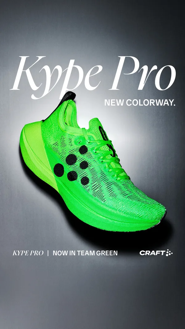
“NEW COLORWAY.”
Why it works
A neon green racing shoe angles across a gray vignette beneath a huge italic "Kype Pro". The announcement is two words, "NEW COLORWAY.", and the footer repeats the model and the shade. For a repeat buyer that is the entire news. The saturated green is the only strong color in the frame, so the shoe is the loudest thing in a feed while no type is loud. A known product in a new shade needs a picture, not a paragraph.
Started 17 Apr 2026. Live when checked on 25 Oct 2026. View in Meta Ad Library ↗
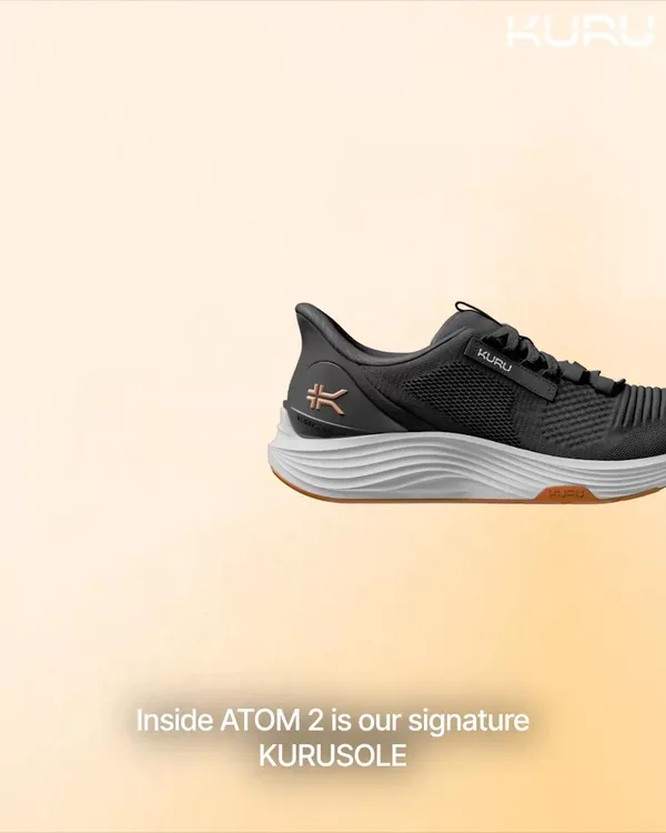
“3+ Million Pairs Sold”
Why it works
A dark sneaker floats at the right edge of a peach gradient and runs off the frame, with one line of white caption at the bottom: "Inside ATOM 2 is our signature KURUSOLE". The picture says nothing about heel pain, which is the actual pitch, so the body carries it with "48,000+ 5-Star Reviews" and "91-Day Returns & Exchanges". Shoes are bought on fit, and here the reassurance sits beside a plain photo in text.
Started 8 May 2026. Live when checked on 25 Oct 2026. View in Meta Ad Library ↗
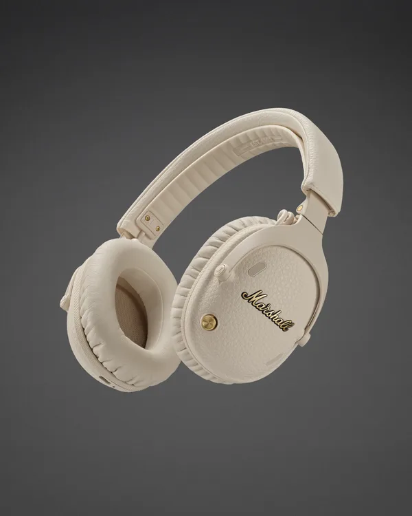
“The star of the show”
Why it works
Cream over-ear headphones tilt in midair against a dark gray gradient, with no line of copy on the picture, only the gold script on the ear cup. The headline, "The star of the show", and a line about merch tees and jumpsuits are held in the caption. When the logo is part of the product, the product can be the only thing in the frame. Marshall's name already appears on the headphones themselves.
Started 18 May 2026. Live when checked on 25 Oct 2026. View in Meta Ad Library ↗
A title and a still product · 8
The type is the only voice: a name, a line, a wordmark. Tracksmith and Maison Louis Marie set short serif lines over the product the way a magazine sets a caption.
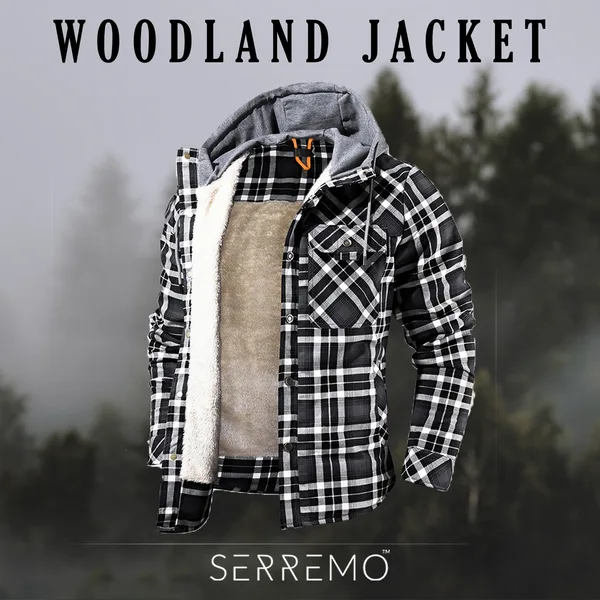
“WOODLAND JACKET”
Why it works
A plaid hooded jacket hangs open against a blurred forest with its fleece lining showing, under the name "WOODLAND JACKET" in tall serif capitals and above a small SERREMO wordmark. The open front does what a caption would do, which is show the warmth. Fog in the background supplies the weather without a snowflake icon or a temperature line. Only a name and a garment are left on the picture, and the sale message waits in the caption.
Started 28 Nov 2025. Live when checked on 25 Oct 2026. View in Meta Ad Library ↗
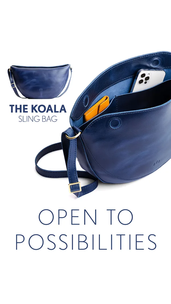
“OPEN TO POSSIBILITIES”
Why it works
The bag is photographed open, with a phone and an orange card holder tucked inside, so capacity is shown instead of claimed. A small closed view and the name "THE KOALA SLING BAG" sit upper left, and a thin-lined tagline closes the bottom of a white frame. On a quiet picture, the interior is the proof, and the white space around it keeps the eye on the pocket the phone slides into. Sizes and colors are left to the headline field.
Started 30 Jan 2026. Live when checked on 25 Oct 2026. View in Meta Ad Library ↗
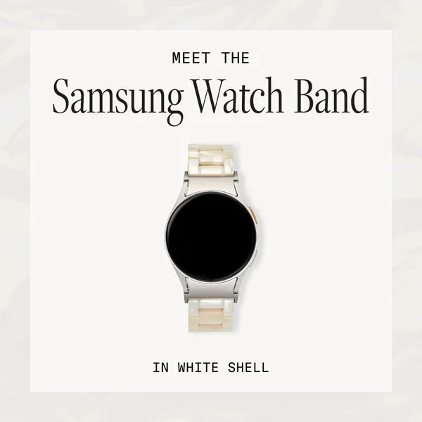
“Meet the newest member of the MACHETE club.”
Why it works
A pearly watch band sits in a framed white card on a pale marbled ground. Above it a small kicker and a large serif line name the product, and below it a spaced-out label gives the color. Nothing else is there to read, so a Samsung owner sees what it fits and which shade it is in a glance. Small accessories sell on taste, and the type here carries that signal because the strap is too small to do it alone.
Started 31 Mar 2026. Live when checked on 25 Oct 2026. View in Meta Ad Library ↗
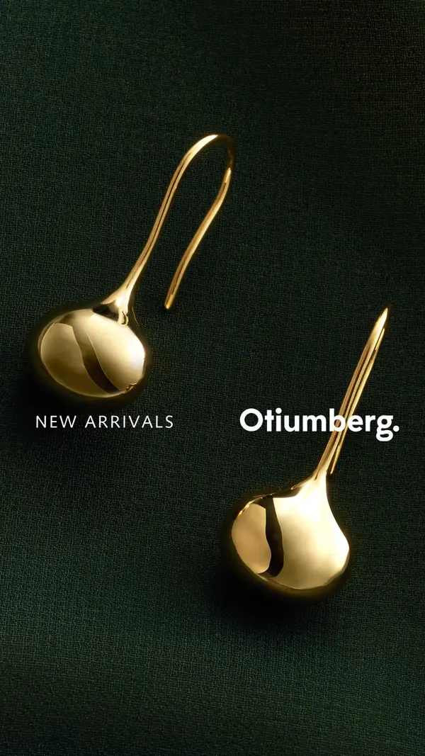
“Sculptural Everyday Style”
Why it works
Gold drop earrings lie on dark green fabric, one pulled to the upper left and the other tilted toward the lower right, with "NEW ARRIVALS" and the brand name set across the middle. The gloss on the gold is the entire message, and the dark cloth makes each reflection brighter. Earrings are tiny in a feed, so the crop is large and the printed copy is only a label. The caption supplies the product name, "Pebble Curve Drop Earrings".
Started 28 Apr 2026. Live when checked on 25 Oct 2026. View in Meta Ad Library ↗
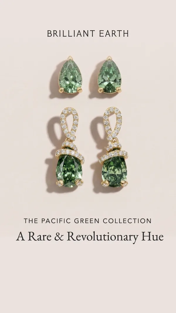
“A Rare & Revolutionary Hue”
Why it works
Matched pairs of green gemstone earrings are laid out symmetrically on a blush ground, studs above and diamond-wrapped drops below, with the brand name over them and the collection name and a serif line under them. Color is the news, so nothing competes with it: no model, no price, no sparkle effects. Seeing small and large stones together gives a sense of scale a single piece would not. Under the pictures, one line turns a shade into a collection.
Started 5 May 2026. Live when checked on 25 Oct 2026. View in Meta Ad Library ↗
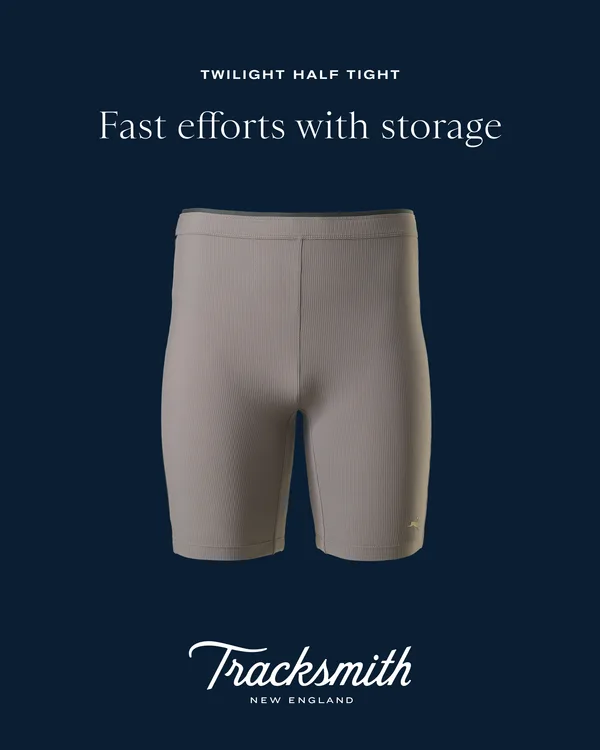
“Fast efforts with storage”
Why it works
Taupe half tights float on solid navy under the label "TWILIGHT HALF TIGHT", with a serif line, "Fast efforts with storage", and a script wordmark at the bottom. The line does the job of a feature list: speed and pockets in a few words. A runner who wants somewhere to put a gel gets the claim without a diagram. The navy is plain enough that the pale garment is the only object in the frame. It ran 163+ days.
Started 15 May 2026. Live when checked on 25 Oct 2026. View in Meta Ad Library ↗
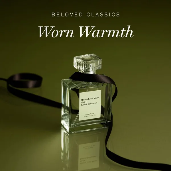
“Worn Warmth”
Why it works
A square glass bottle with a paper label stands on a reflective olive surface with a black ribbon curling around it, under a small "BELOVED CLASSICS" label and a large serif title, "Worn Warmth". A scent cannot be seen, so the ad borrows words that feel like a texture. The bottle's label stays legible, which gives the product its name and size. The caption adds a reviewer line, "I can't quit this perfume right now."
Started 29 May 2026. Live when checked on 25 Oct 2026. View in Meta Ad Library ↗
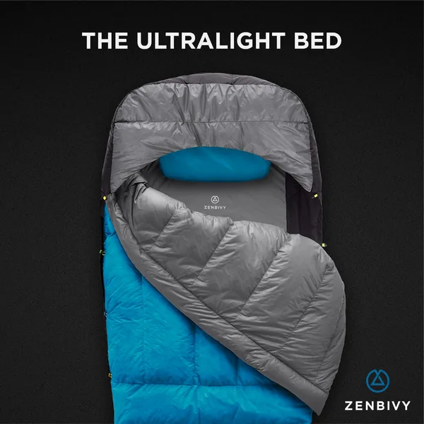
“The Ultralight Bed”
Why it works
A sleeping quilt is shown from above on solid black, opened so the blue lining and quilted gray panels are visible, with a small pillow at the head and a title across the top: "THE ULTRALIGHT BED". The title borrows a word from furniture to say what camping gear is for, and the open layout answers "what is it like inside?" before anyone asks. Against the dark ground, the blue is the only warm color.
Started 23 Jun 2026. Live when checked on 25 Oct 2026. View in Meta Ad Library ↗
The whole range in one frame · 6
A row, stack or set of dots answers how many options exist without a grid. goodr and Milk Makeup show colors and shades before a word is read.
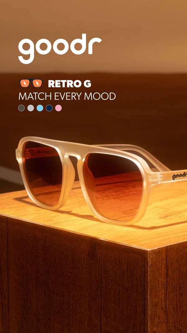
“MATCH EVERY MOOD”
Why it works
Translucent retro sunglasses sit on a wooden block under warm light, with the logo, "RETRO G" and "MATCH EVERY MOOD" stacked in the upper left. A row of small colored dots under that line stands in for the range, so the picture promises variety without a grid of products. The body copy fills in the number, "Shop 100+ color combos". Dots are the cheapest way to say there are more pairs than the one shown.
Started 25 Mar 2026. Live when checked on 25 Oct 2026. View in Meta Ad Library ↗
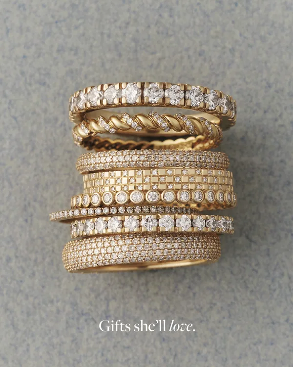
“Gifts she'll love.”
Why it works
A stack of gold rings, each a different band of stones or twisted gold, is photographed from above on gray-blue felt, with a small italic "Gifts she'll love." near the bottom. The stack does two jobs: it shows range, and it shows the pieces worn together, which is how the brand wants them bought. A gift line this small asks the viewer to supply the occasion. Detail in the gold is the sell.
Started 17 Jun 2026. Live when checked on 25 Oct 2026. View in Meta Ad Library ↗
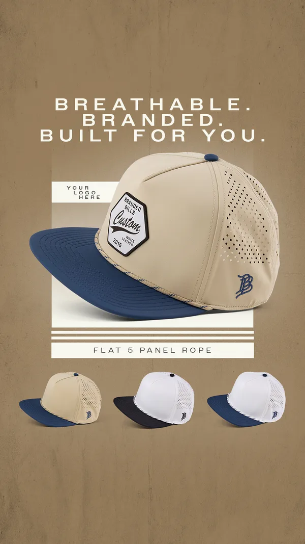
“BREATHABLE. BRANDED. BUILT FOR YOU.”
Why it works
A cream cap with a navy brim sits in a framed panel on a tan ground, with a header of short single words above it and a placeholder patch reading "YOUR LOGO HERE". Smaller white and navy variants run along the bottom. The placeholder is the clever part: a business buyer sees where their own mark would go before reading any copy. Color choice is shown in the row beneath, so the layout explains customization on its own.
Started 22 Jun 2026. Live when checked on 25 Oct 2026. View in Meta Ad Library ↗
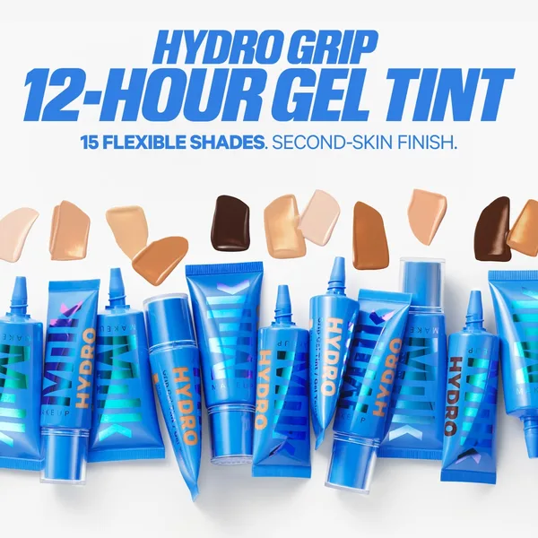
“15 FLEXIBLE SHADES.”
Why it works
Skin-tone swatches float above a scattered row of blue tubes on white, with a bold blue headline across the top reading "HYDRO GRIP 12-HOUR GEL TINT". The swatches do the job a model would: they show the shade range as a smear of color. The tubes carry the brand through their own print, so no separate logo is needed. Makeup sells on match and texture, and this frame gives both without a face. Right under the headline, a claim line spells out the finish.
Started 24 Jun 2026. Live when checked on 25 Oct 2026. View in Meta Ad Library ↗
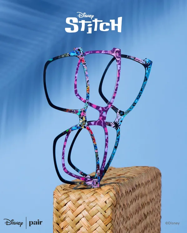
“Say aloha to DISNEY'S STITCH”
Why it works
Stacked frames printed in blue, purple and black lean on one another on a woven block in front of a blue ground, under the Disney Stitch logo, with the partner marks in the corners. The pile shows several patterns at once, which is the reassurance a licensed collection needs. The licensed logo is the headline, so the picture can hold back. Glasses are usually shown on a face, and here the frames stand alone.
Started 26 Jun 2026. Live when checked on 25 Oct 2026. View in Meta Ad Library ↗
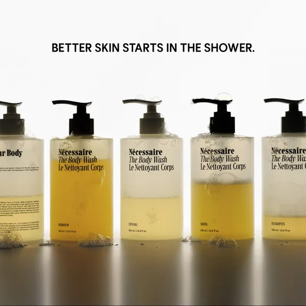
“BETTER SKIN STARTS IN THE SHOWER.”
Why it works
A row of pump bottles stands on a pale reflective surface, each filled with a different shade of liquid and foam clinging to the base. One sentence of black capitals sits above them: "BETTER SKIN STARTS IN THE SHOWER." The bottles are cropped at the sides, so the row seems to continue. Moving the product from soap to skincare is the sentence's job, and the varied liquids suggest a range of scents without a label to read.
Started 30 Jun 2026. Live when checked on 25 Oct 2026. View in Meta Ad Library ↗
Product staged on a prop or in a landscape · 3
A scene carries what an adjective would. Mount to Coast wedges a shoe between icy rocks and Stetson sets a bottle on sand and driftwood, both things a feed cannot let you test.
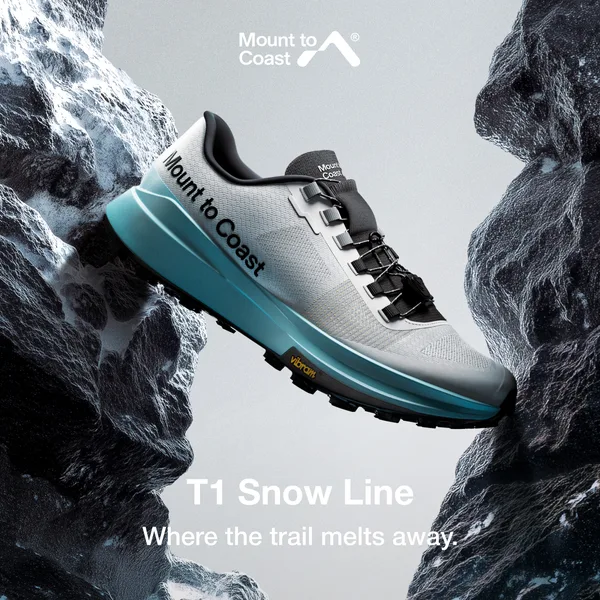
“Where the trail melts away.”
Why it works
A pale shoe with a teal sole is wedged between two dark, icy rock faces, with the brand mark at the top and a two-line caption at the bottom. The rock does the work an adjective would, saying snow, cold and grip. The colorway name, "T1 Snow Line", is the only product copy on the picture. Trail shoes are sold on traction, and the Vibram mark on the sole is the one spec the image shows.
Started 9 Mar 2026. Live when checked on 25 Oct 2026. View in Meta Ad Library ↗
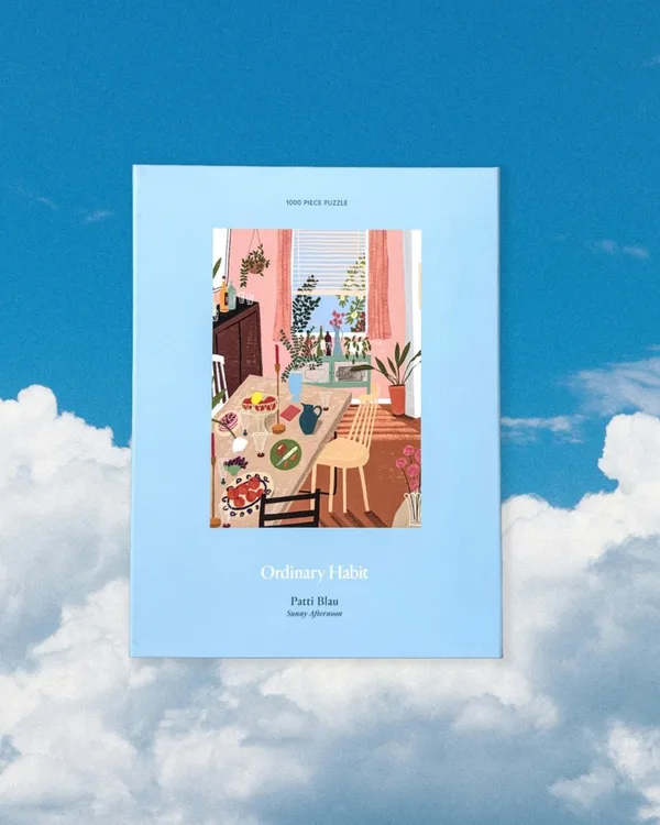
“Sunny Afternoon 1000 Piece Puzzle”
Why it works
A pale blue puzzle box is tilted against a sky of clouds, with an illustration of a sunny dining table framed on the front. The sky supplies the idea of the picture, an easy afternoon, without a caption. The box is the only object in the frame, so the artwork on it is what a viewer reads first. A puzzle is a gift as much as a hobby, and the cloud backdrop gives it a calm that a plain shelf shot would not.
Started 2 Jul 2026. Live when checked on 25 Oct 2026. View in Meta Ad Library ↗
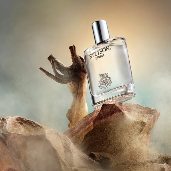
“Be Your Own Legend”
Why it works
A tilted cologne bottle rests on a block of sandy rock with a twist of driftwood beside it, and blown sand drifts through a warm haze. The scene carries the scent where the viewer cannot smell it: dry, woody, outdoors. The bottle's own label is the only text on the picture. The tagline lives in the headline, so the image is free to be pure atmosphere. It ran 109+ days, the shortest in the set.
Started 8 Jul 2026. Live when checked on 25 Oct 2026. View in Meta Ad Library ↗
A quiet picture with an offer or a booking · 4
When the offer is the reason to click, it gets its own band. gentlebands.com gives the discount a dark side panel and REP Fitness puts a free appointment in a pill over the rack.
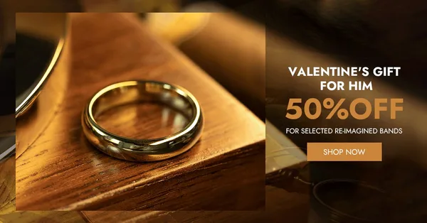
“VALENTINE'S GIFT FOR HIM”
Why it works
A single gold band rests on a block of wood, lit warm and shot close enough to see the polish on the curve. Everything that sells is pushed into a dark panel on the right: the line "VALENTINE'S GIFT FOR HIM", a large 50% figure and one button. Jewelry is small and easy to read as cheap, and the macro crop answers that before the discount appears. The offer gets its own panel, so the ring is never crowded. It ran 452+ days, the longest in the set.
Started 30 Jul 2025. Live when checked on 25 Oct 2026. View in Meta Ad Library ↗
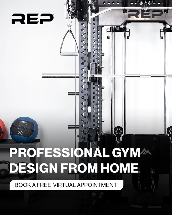
“Build Your Dream Gym”
Why it works
A cropped power rack with a pulley handle, a barbell and a weighted ball fills the frame, with a white logo at the top and a rounded pill reading "BOOK A FREE VIRTUAL APPOINTMENT" at the bottom. For equipment that costs real money, the ad leaves out a price and offers a conversation instead. What follows the click is a specialist, not a checkout, and the pill says so.
Started 18 May 2026. Live when checked on 25 Oct 2026. View in Meta Ad Library ↗
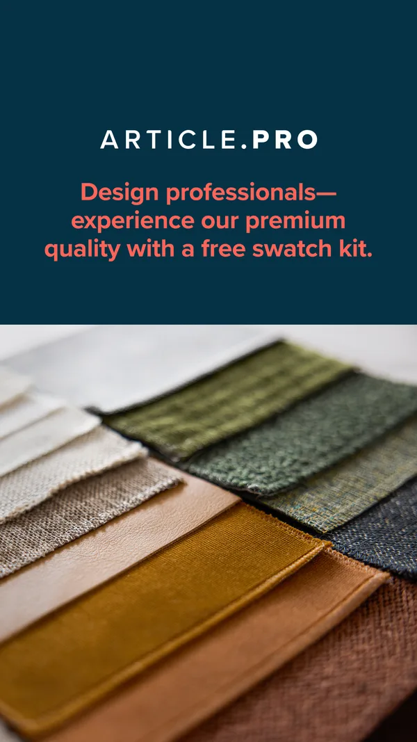
“experience our premium quality with a free swatch kit.”
Why it works
The top of the frame is a flat teal panel with the ARTICLE.PRO wordmark and a single coral sentence. The bottom is a close photograph of fabric and leather swatches fanned out in mustard, green and rust. The split shows a professional audience exactly what the free kit contains, and the offer is the only thing set in type. Swatches stand in for a product with no single hero, and the body copy lists the trade perks that come with it.
Started 27 May 2026. Live when checked on 25 Oct 2026. View in Meta Ad Library ↗
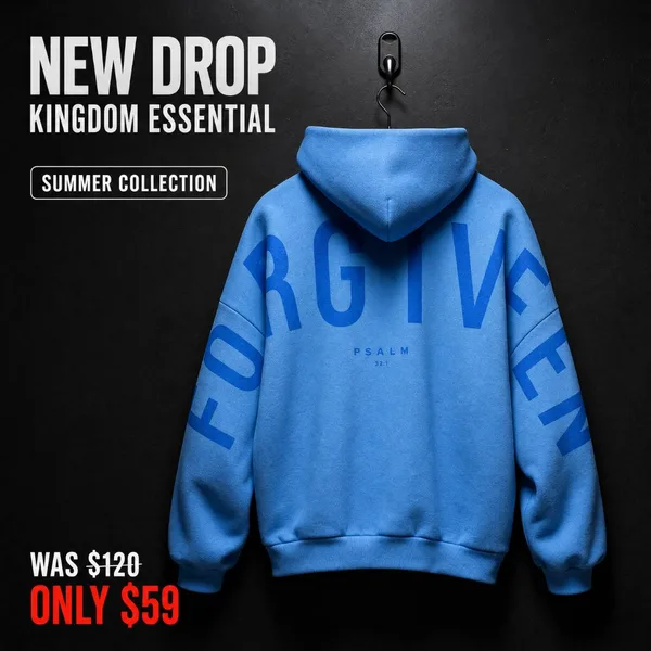
“NEW DROP”
Why it works
A blue hoodie hangs from a single hook against a black wall, its sleeves printed with the oversized word "FORGIVEN". The headline sits top left, a small pill reads "SUMMER COLLECTION", and the price lower left shows "WAS $120" over a red "ONLY $59". Black behind blue makes the garment pop, and the print is large enough to read as design, not text. It is a discount ad that still leaves most of the frame to the hoodie.
Started 20 Jun 2026. Live when checked on 25 Oct 2026. View in Meta Ad Library ↗
Pattern or card behind the product · 4
A printed backdrop or a borrowed format does the job of copy. Shopzoki's valentine-card layout and Crazy Dog T-Shirts' floating gift boxes frame the product as a present.
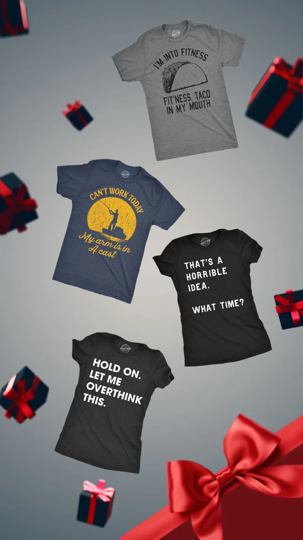
“Funny Shirts & More”
Why it works
Shirts drift down a gray gradient between wrapped gift boxes, and a red bow fills the bottom corner. No sale line and no product name appear on the picture. The jokes printed on the shirts, such as "HOLD ON. LET ME OVERTHINK THIS.", are the only copy, so the product is its own message. The gift boxes turn a casual novelty-tee ad into a present idea without a word about the season. Slogans on the garments do what a caption normally would.
Started 22 Oct 2025. Live when checked on 25 Oct 2026. View in Meta Ad Library ↗
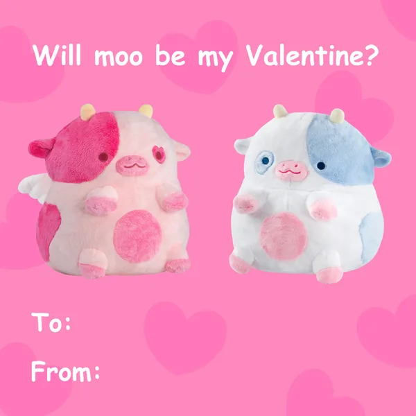
“Will moo be my Valentine?”
Why it works
Pink hearts, two plush cows and a classroom-card question, "Will moo be my Valentine?", with blank To and From lines at the bottom. The borrowed card format is the whole idea: it tells the viewer this is a gift to hand over, and the fill-in lines invite tagging a person. The picture makes no feature claims. Heatable-heart details live in the long body copy, so the quiet picture never has to show them.
Started 1 Feb 2026. Live when checked on 25 Oct 2026. View in Meta Ad Library ↗

“RECON CHEST HOLSTER”
Why it works
A tan molded holster with black buckles sits dead center, throwing a soft shadow across a white ground printed with thin gold contour lines. The title is a block of heavy capitals above it, so a buyer who already knows what a chest holster is gets the model name first. The map-line pattern hints at hunting and trail use without a photo of anyone using it. Customer quotes in the body copy then carry the proof the picture leaves out.
Started 1 Apr 2026. Live when checked on 25 Oct 2026. View in Meta Ad Library ↗
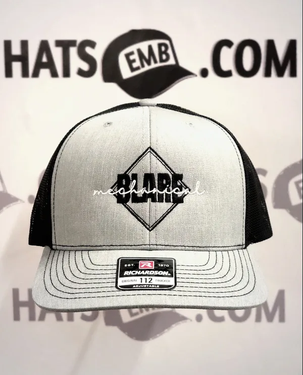
“Custom Trucker Hats”
Why it works
A gray-and-black trucker cap with a diamond embroidery for a mechanical company faces the camera in front of a wall printed with the shop's own logo, repeated. The straight-on framing shows the stitching a customer would receive. The sample carries another company's mark, so a business owner can picture their own name on the same cap. Branding comes from the wall, and the picture needs no copy to say who made it.
Started 2 Jun 2026. Live when checked on 25 Oct 2026. View in Meta Ad Library ↗
The parts of the ad
- 01
Illustration. In 3 of 30 ads on this page.
- 02
Packaging. In 3 of 30 ads on this page.
- 03
Price or offer. In 3 of 30 ads on this page.
Headlines short enough to sit on the product
Lifted from the ads above. Swap in your own product.
- 01[Model name], then [what it lets you do] in a few wordsTracksmith, “Fast efforts with storage”, 163 days
- 02[Collection name]: [what is rare about it]Brilliant Earth, “A Rare & Revolutionary Hue”, 173 days
- 03[Product], now in [new color]Craft Sportswear, “NEW COLORWAY.”, 191 days
- 04[Occasion line] + [one product stack, no price]gorjana, “Gifts she'll love.”, 130 days
Cutting a Meta ad down to one product
- Pick the product that looks bestChoose the single item whose finish does the persuading, as Otiumberg does with gold earrings on dark cloth.
- Say what it is in one linePut the product name or a short claim on the picture and stop there, as Mount to Coast does with its colorway name.
- Move the proof into the captionSpecs, reviews and returns belong in the body, where KURU and Keychron put theirs.
- Let one color leadKeep the ground plain so the product holds the only strong color, as Craft's green shoe does on gray.
- Give an offer its own panelIf the offer is the reason to click, split the frame so it has its own band, as Article and gentlebands.com do.
- Hint at range without a gridUse dots, a row or a stack to say there are more options, as goodr and Milk Makeup do.
Sizes and Safe Zones are on our Instagram Safe Zone checker page.
What the caption carries
Specs go in the body. Keychron's picture says "Ultra-fast 8K wireless." and its body adds "up to 660 hours of battery life".
Proof goes in the body. KURU's picture is a plain sneaker with one caption line; the body adds "48,000+ 5-Star Reviews" and "91-Day Returns & Exchanges".
Features go in the body. Aviator Wallet's render carries no headline, while its body lists "Holds up to 20 cards" and "Customizable in over 650 variations".
The name is the headline
A product name can be the whole line. Serremo's picture says "WOODLAND JACKET" and Invader Concepts' says "RECON CHEST HOLSTER", enough for a buyer who already knows the category.
A model name carries the news. Craft Sportswear sets "Kype Pro" in large italic type and adds "NEW COLORWAY.", which tells a repeat buyer everything.
A mood can stand in for a function. Maison Louis Marie titles its bottle "Worn Warmth", because a scent cannot be shown and a feeling can be named.
Minimalist ad questions, from caption to product pick
Do minimalist ads work for products that need explaining?
They can, but only if the explaining moves into the caption. Aviator Wallet leaves its picture free of headline text and lists what the wallet does in the body, and KURU puts reviews and returns in the body under a plain sneaker.
How much text should a minimalist Meta ad put on the picture?
As little as one line, and often just a product name. Tracksmith's picture carries "Fast efforts with storage" and nothing more, while Marshall Headphones' picture carries no line at all.
What backgrounds do minimalist ads use?
Most use a studio background, dark or softly tinted, with one product lit to look three-dimensional. Marshall Headphones sits on dark gray, Milk Makeup on white and Mount to Coast between rocks.
Should a minimalist ad include a price or an offer?
Only when the offer is the reason to click, and then it gets its own panel instead of sitting on the product. gentlebands.com puts its discount in a dark panel beside the ring and Article gives its swatch kit its own band, and about a tenth of the set leads with an offer.
Which products suit minimalist ads best?
Products whose finish does the persuading, such as jewelry, accessories and design-led hardware. Jewelry and accessories are 40% of this set, led by Otiumberg and Brilliant Earth, and gadgets such as Keychron float at an angle.
Make minimalist ads like these
Paste your client's website or your own and get minimalist ads that keep the picture quiet and leave the specs, proof and offer to the caption.
How we pick ads. We search Meta's public Ad Library for ads from DTC brands that sell to US and UK shoppers, keep ads running 14 days or more, skip catalogue ads, and show at most 3 per brand. Days running is a spend signal: brands rarely keep paying for an ad that doesn't sell. Day counts are as of the check date above. Breakdowns are written by Gimme Gimme's ad analysis engine from each ad's image and copy, and edited by Josh Jackson, founder. Not affiliated with the brands shown; ads appear for commentary and analysis. To have an ad removed, email hello@getgimmegimme.com and we'll take it down within 7 days.