26 Comparison Ad Examples Brands Kept Running on Meta
Checked 25 Oct 2026 · 26 ads from 25 brands, from Meta's Ad Library · How we pick ads
One frame has to hand over a verdict, so a comparison ad's first job is deciding who sits on the losing side. Across the 26 ads here, that side is seldom a named rival: it is a category, a price, the buyer's old habit or the brand's own range. The longest run, 776 days, is Bellroy's wallet set against itself.
- 776days, the longest run: Bellroy's wallet against itself
- 87days, the median run on the page
- 12ads ran past 90 days when we checked
- 20days, the shortest run on the page
Who sits on the losing side of the frame
Grouped by the job each ad does. Swipe a row, and tap “Why it works” for our breakdown.
A claim list, theirs against ours · 3
SaleHoo and KILOS GEAR stack crosses against ticks so the buyer reads a verdict row by row, and AppScenic adds a "RECOMMENDED" badge above its column. The losing column keeps a generic label such as "OTHER OUTDOOR SLEEPING PAD" or "China Dropshipping".
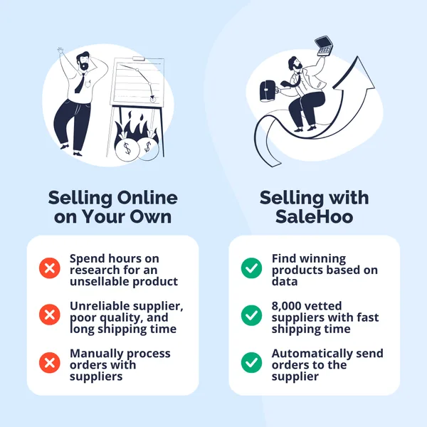
“Try SaleHoo For 7 Days at $1”
Why it works
Two white cards on a pale blue ground set a stressed cartoon seller above a column headed "Selling Online on Your Own" and a calm one riding an upward arrow above "Selling with SaleHoo". Red crosses fill the left list and green ticks the right. The losing side is the reader's own current routine, so the ad needs no competitor at all. Only after the verdict does the headline make its offer.
Started 14 Sep 2025. Live when checked on 25 Oct 2026. View in Meta Ad Library ↗
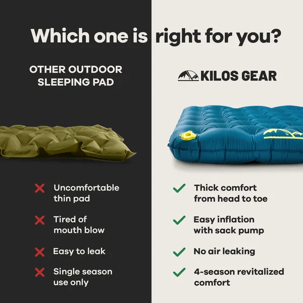
“Which one is right for you?”
Why it works
A dark half holds a flat olive sleeping pad under "OTHER OUTDOOR SLEEPING PAD" and four red crosses; a light half holds a teal pad, plump with air, under the brand's logo and four green ticks. The crosses name annoyances any camper has met: thin, leaky, tiring to blow up. Asking a question across the top, not making a claim, lets the viewer reach the verdict themselves.
Started 29 May 2026. Live when checked on 25 Oct 2026. View in Meta Ad Library ↗
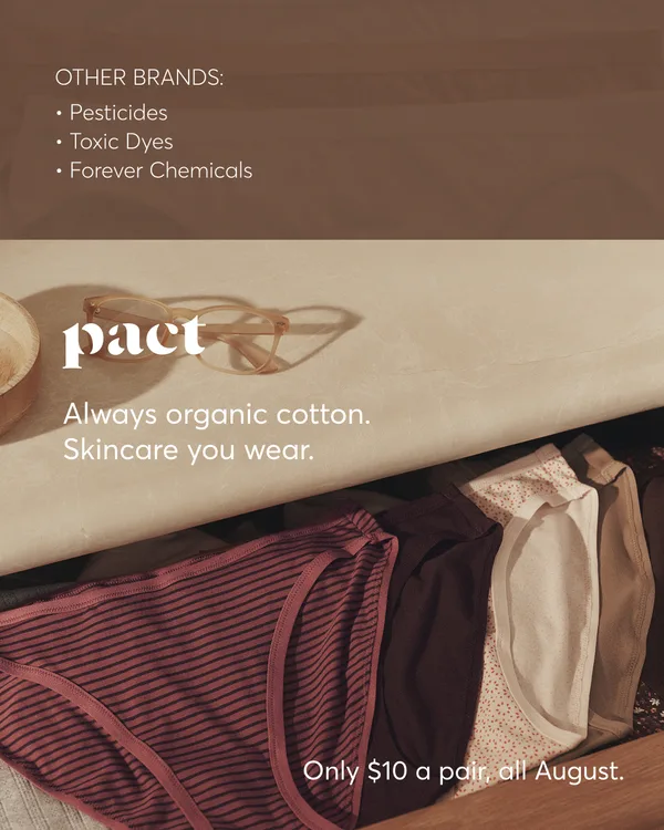
“Nothing Harsh, Nothing Hidden”
Why it works
A brown band at the top lists "OTHER BRANDS:" with "Pesticides", "Toxic Dyes" and "Forever Chemicals". Below it the pact logo sits over a drawer of folded underwear in striped and dotted patterns, under "Always organic cotton. Skincare you wear." The other side is a generic label, never a named company. Soft light and folded cotton keep the mood warm while the list carries the contrast.
Started 30 Jul 2026. Live when checked on 25 Oct 2026. View in Meta Ad Library ↗
Rival and product in the same frame · 5
Apollo, Step One and Nanoleaf put both sides into one picture so the difference is seen before it is read: a smile against a frown, blue against red heat, a slim column beside a shaded lamp. We Feed Raw and Paper Shoot add a ladder or a count.
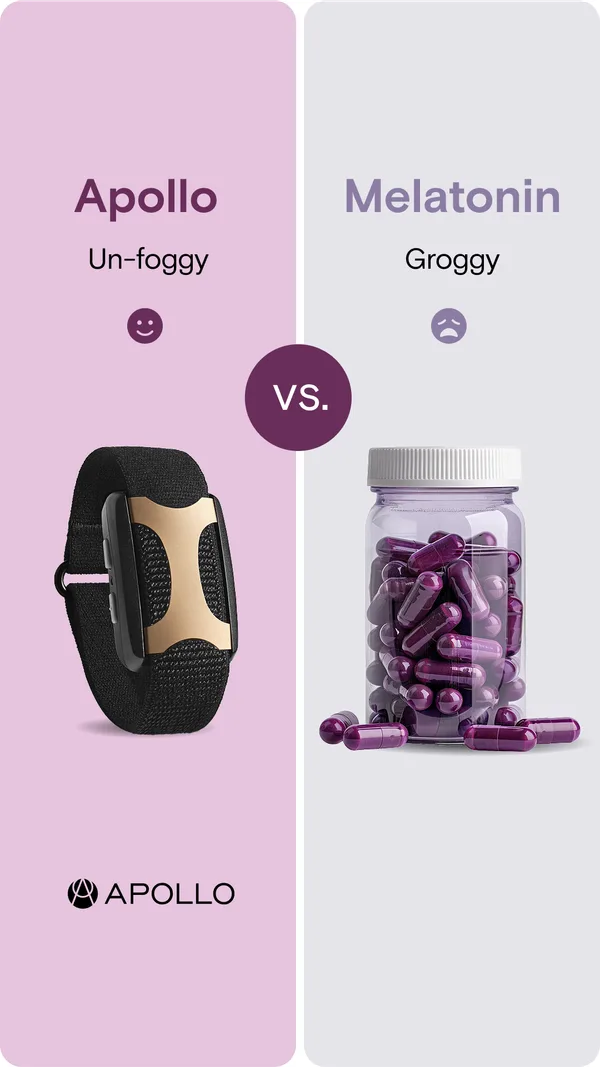
“60 More Min of Sleep”
Why it works
A mauve panel and a grey one meet under a round "VS." disc. On the left a black Apollo wristband sits under a smile and the word "Un-foggy"; on the right a jar of purple capsules sits under a frown and "Groggy", headed "Melatonin". The rival is a product category most buyers already know, so the contrast is felt before it is argued. Smile against frown says in a glance what the body copy takes a paragraph to explain.
Started 8 Apr 2026. Live when checked on 25 Oct 2026. View in Meta Ad Library ↗
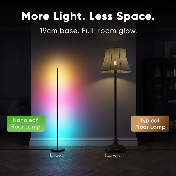
“More Light. Less Space.”
Why it works
Two lamps stand in a dark room: a slim colored column on the left tagged "Nanoleaf Floor Lamp" and a shaded traditional lamp on the right tagged "Typical Floor Lamp". Base widths are marked underneath, "19cm" and "35cm", so the headline is a measurement the viewer can read off the picture. The generic label on the right means the brand claims a gap over the whole category, not over one maker.
Started 24 Jul 2026. Live when checked on 25 Oct 2026. View in Meta Ad Library ↗
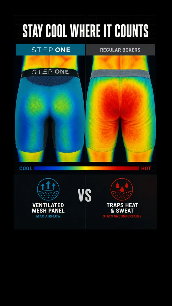
“STAY COOL WHERE IT COUNTS”
Why it works
A thermal image of boxer shorts from behind shows blue and green on the brand's side and red and orange under "REGULAR BOXERS", above a bar running from "COOL" to "HOT". Beneath, "VENTILATED MESH PANEL" faces "TRAPS HEAT & SWEAT". Color is the argument, so nobody has to read a spec to see which side runs hotter, and the rival is a whole category, labeled and not named.
Started 2 Sep 2026. Live when checked on 25 Oct 2026. View in Meta Ad Library ↗
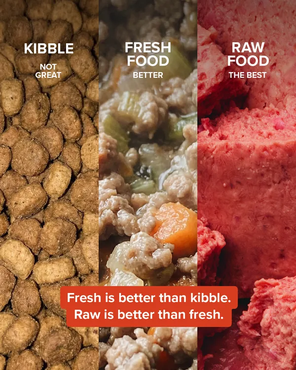
“Fresh is better than kibble. Raw is better than fresh.”
Why it works
Three vertical strips of close-up food, kibble, a cooked mix with carrot and raw meat, are tagged "KIBBLE NOT GREAT", "FRESH FOOD BETTER" and "RAW FOOD THE BEST". A red banner underneath states the ladder: "Fresh is better than kibble. Raw is better than fresh." Three steps replace the usual two sides, which puts the brand on the top rung, and the textures in the photos make the difference visible without a chart.
Started 7 Sep 2026. Live when checked on 25 Oct 2026. View in Meta Ad Library ↗
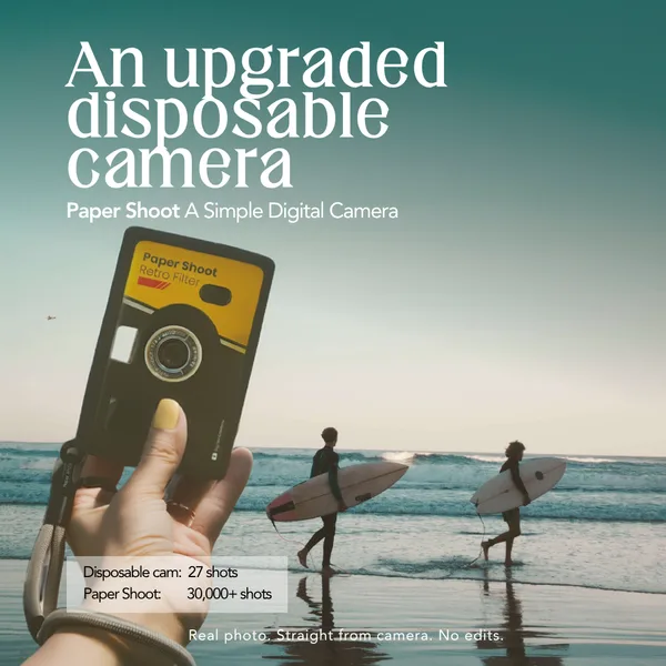
“An upgraded disposable camera”
Why it works
A hand holds a yellow-and-black film-style camera in front of surfers on a beach, under "An upgraded disposable camera". A small table in the lower left sets "Disposable cam: 27 shots" against "Paper Shoot: 30,000+ shots". The rival is an object the buyer has held, and the numbers turn the gap into a count, not an adjective. The footer line, "Real photo. Straight from camera. No edits.", reassures the viewer that the picture is not a mock-up.
Started 21 Sep 2026. Live when checked on 25 Oct 2026. View in Meta Ad Library ↗
A rival in the headline, none in the frame · 5
Humble Brands and Bon Charge put the losing side in a sentence ("Their shampoo is mostly water." "Most skincare sits on top.") and let the product picture answer it. The rival costs nothing to show because the viewer supplies it.
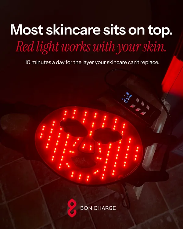
“Most skincare sits on top.”
Why it works
A red-lit face mask glows on a dark tile floor beneath two lines: "Most skincare sits on top." in plain white and "Red light works with your skin." in red italics. The picture holds no second product, because the rival is every cream and serum the viewer already owns. One sentence sets it up and the next answers it. Italics, not a box or a badge, mark which half is the brand's.
Started 19 Jun 2026. Live when checked on 25 Oct 2026. View in Meta Ad Library ↗
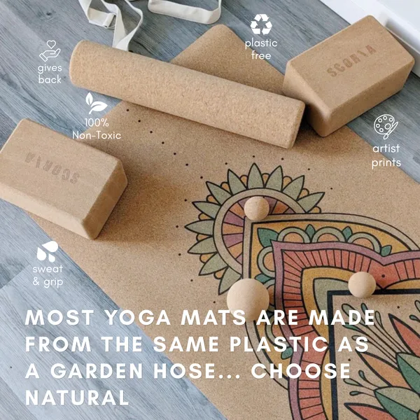
“MOST YOGA MATS ARE MADE FROM THE SAME PLASTIC AS A GARDEN HOSE”
Why it works
A flat lay of cork blocks, a roller and a printed mat carries icon callouts for "plastic free", "100% Non-Toxic", "artist prints" and "sweat & grip". The line across the bottom sets the whole category against the product: "MOST YOGA MATS ARE MADE FROM THE SAME PLASTIC AS A GARDEN HOSE... CHOOSE NATURAL". The comparison is a single sentence and a material. Nobody needs to look up a garden hose, so the other side arrives pre-explained.
Started 3 Aug 2026. Live when checked on 25 Oct 2026. View in Meta Ad Library ↗
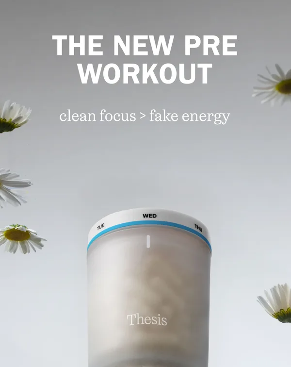
“clean focus > fake energy”
Why it works
A pale grey backdrop holds white daisies and a frosted tub with a day-of-the-week band, under "THE NEW PRE WORKOUT" and a serif subline, "clean focus > fake energy". The greater-than sign turns a taste claim into a comparison without a second product on screen. The rival is not a brand but a feeling, the jittery kind. The post's headline, "Meet Clarity.", names the product only after the contrast has done its work.
Started 5 Aug 2026. Live when checked on 25 Oct 2026. View in Meta Ad Library ↗
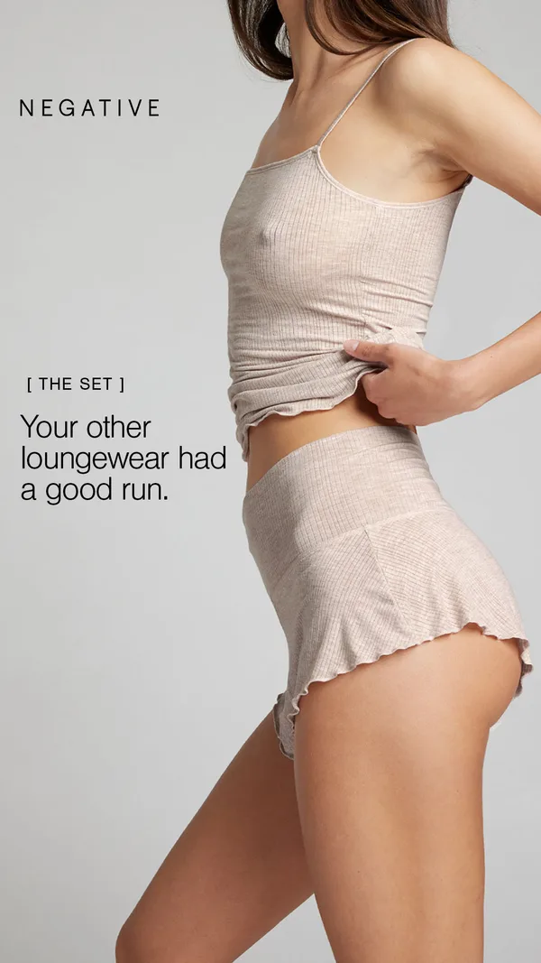
“Your other loungewear had a good run.”
Why it works
A model in a ribbed oatmeal camisole and ruffled shorts is cropped below the face against grey, beside the tag "[ THE SET ]" and the line "Your other loungewear had a good run." The comparison is one sentence in the past tense: the rival is whatever the viewer wears now, retired politely. With no second product, the softness is left to the fabric in the frame.
Started 27 Aug 2026. Live when checked on 25 Oct 2026. View in Meta Ad Library ↗
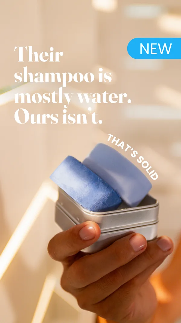
“Their shampoo is mostly water. Ours isn't.”
Why it works
A hand holds two blue shampoo bars in a metal tin in sunlit bathroom light, under the white serif lines "Their shampoo is mostly water. Ours isn't." A blue "NEW" tag sits at the upper right and the tilted words "THAT'S SOLID" run beside the bars. The solid bars answer the headline with a shape instead of a claim. Beneath, the body copy lists "No silicones. No sulfates. No plastic bottle."
Started 5 Oct 2026. Live when checked on 25 Oct 2026. View in Meta Ad Library ↗
Measured against something already known · 7
Bellroy compares a wallet with itself on "DAY 1000", Anyday sets one dish beside a pile of cookware, 70mai holds a dash cam next to a bank card, and The Cumin Club sets "$5.99" for its pouch against "$18.99" for takeout. Shay and Blue blacks out a designer bottle and claims a quarter of the price. The yardstick is something the buyer already knows, so nothing needs explaining.
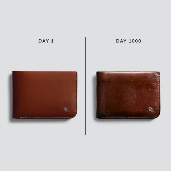
“DAY 1 DAY 1000”
Why it works
A brown leather wallet sits on each side of a thin vertical line, one smooth and new under the label "DAY 1", the other darker, scuffed and creased under "DAY 1000". No rival appears. The other side is the same wallet after years of use, which turns the usual worry, will it wear badly, into the selling point. The body backs it with a three-year warranty. It is the longest run on the page, at 776 days.
Started 9 Sep 2024. Live when checked on 25 Oct 2026. View in Meta Ad Library ↗
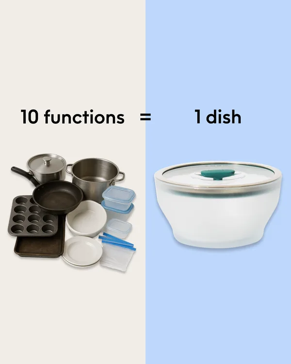
“10 functions = 1 dish”
Why it works
A beige half holds a heap of pots, pans, muffin tins and storage tubs; a blue half holds one lidded dish with a teal valve. Between them runs the equation "10 functions = 1 dish". The other side is the buyer's own cupboard, which needs no introduction. Arithmetic does the persuading before any copy is read. Microwave, oven, freezer and dishwasher use follow as a short ticked list in the body.
Started 20 Oct 2025. Live when checked on 25 Oct 2026. View in Meta Ad Library ↗

“LUXURY SCENTS AT A QUARTER OF THE PRICE.”
Why it works
A pink floral backdrop holds a solid black silhouette of a bottle on the left and the brand's clear lilac bottle on the right, under "LUXURY SCENTS AT A QUARTER OF THE PRICE." The rival is blacked out, so each viewer fills in whichever designer bottle they have in mind, and the brand stays free of any named claim. One fraction does the selling, and the silhouette keeps the frame to a single idea.
Started 29 Jun 2026. Live when checked on 25 Oct 2026. View in Meta Ad Library ↗
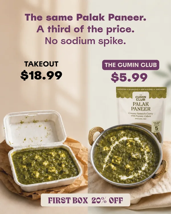
“The same Palak Paneer. A third of the price.”
Why it works
A takeout box of palak paneer sits on the left above "TAKEOUT $18.99", and the brand's pouch beside a steel bowl of the same dish sits on the right above "THE CUMIN CLUB $5.99". The opening line promises "The same Palak Paneer." before the prices land, so the viewer compares like with like. The other side is a habit, ordering in, not a company. Closing the frame, a "FIRST BOX 20% OFF" banner arrives only after the comparison.
Started 17 Jul 2026. Live when checked on 25 Oct 2026. View in Meta Ad Library ↗
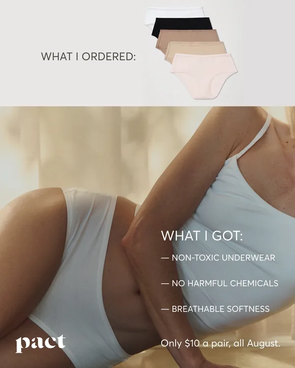
“The Clean Swap Is $10”
Why it works
A strip across the top shows a stack of five briefs under "WHAT I ORDERED:", and a large photo of a woman reclining in white underwear carries "WHAT I GOT:" with three short benefits. The labels set up a promise and a delivery, and the delivery is the better half. Because one image holds both labels, the viewer reads the comparison top to bottom the way they would read a before and after.
Started 30 Jul 2026. Live when checked on 25 Oct 2026. View in Meta Ad Library ↗

“I once followed two women”
Why it works
A split frame shows two older women walking away from the camera on a park path, one in a quilted jacket with a backpack and one in a pale blue shirt, with a presenter in a circle at the center and the caption "I once followed two women,". The hook opens a story rather than a claim, and the viewer is left to draw the comparison between the two walkers. The face in the circle reads as a person's story, not a brand layout.
Started 3 Aug 2026. Live when checked on 25 Oct 2026. View in Meta Ad Library ↗
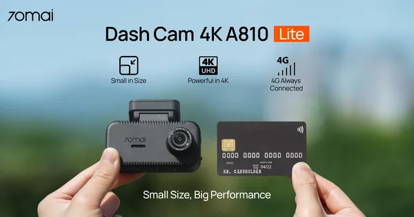
“Small Size, Big Performance”
Why it works
A dash cam sits in one hand and a bank card in the other against a soft blue-green blur, with three icon callouts above: "Small in Size", "Powerful in 4K" and "4G Always Connected". The card is the ruler. Everyone knows its size, so the camera's footprint reads without a spec sheet, and the caption "Small Size, Big Performance" states the contrast.
Started 24 Aug 2026. Live when checked on 25 Oct 2026. View in Meta Ad Library ↗
Our own range, laid out to choose · 6
Casper, Paula's Choice and Cotopaxi put their own products side by side so the shopper picks a size or a feel inside the ad. The question moves from "this or a rival?" to "which of ours?"
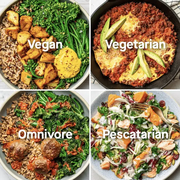
“The Easiest Way to Eat Healthy”
Why it works
Four close squares of food photography each carry one word of diet in white type: "Vegan", "Vegetarian", "Omnivore" and "Pescatarian". Nothing is ranked against anything. The comparison runs across shoppers, not products, and the brand's claim is that one service feeds all four. Here a customer review in the body does the vouching, so the grid stays a plain menu of who the service is for.
Started 16 Nov 2025. Live when checked on 25 Oct 2026. View in Meta Ad Library ↗
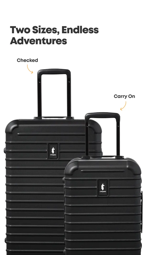
“Two Sizes, Endless Adventures”
Why it works
Two matte black hard-shell suitcases stand one in front of the other, the larger tagged "Checked" and the smaller "Carry On" with thin orange arrows, under "Two Sizes, Endless Adventures". There is no rival and no verdict; the comparison is a size guide wearing a headline. Overlap in the picture shows the height difference, so a shopper deciding between sizes does not need a product page.
Started 29 Apr 2026. Live when checked on 25 Oct 2026. View in Meta Ad Library ↗
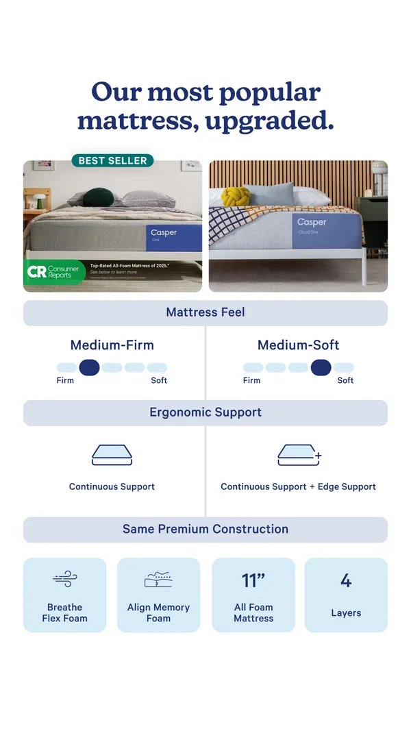
“Our most popular mattress, upgraded.”
Why it works
Two bed photos sit above a spec table, the left tagged "BEST SELLER" with a Consumer Reports badge and the right showing the upgraded Cloud One. A slider places each mattress on a firm-to-soft scale, medium-firm against medium-soft, and a second row separates "Continuous Support" from "Continuous Support + Edge Support". A closing band of shared specs says the build is the same. Both sides belong to Casper, so the choice happens inside the ad.
Started 22 May 2026. Live when checked on 25 Oct 2026. View in Meta Ad Library ↗
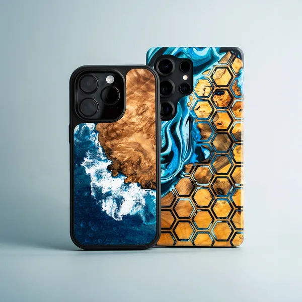
“Live Edge vs. Traveler – Status or Protection? You Decide.”
Why it works
Two phone cases overlap on a pale blue-grey ground, one with a blue wave breaking against wood grain and the other with an amber honeycomb. The picture carries no text, so the headline, "Live Edge vs. Traveler – Status or Protection? You Decide.", sets the contrast, and the body adds "Luxury vs. Durability". Two cases from the same brand face each other, and the shopper is invited to pick.
Started 24 Aug 2026. Live when checked on 25 Oct 2026. View in Meta Ad Library ↗
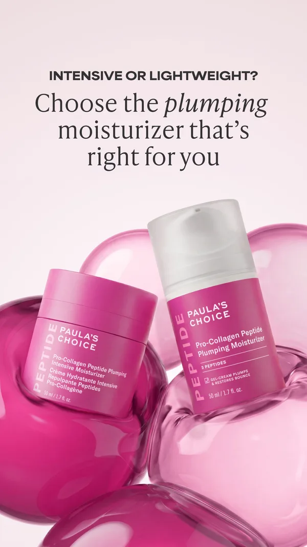
“Choose the plumping moisturizer that's right for you”
Why it works
Two pink-labeled peptide moisturizers, a jar and a pump bottle, rest among glossy translucent spheres under "INTENSIVE OR LIGHTWEIGHT?" and "Choose the plumping moisturizer that's right for you". The comparison sits inside the brand's own range and is aimed at the shopper's skin, not at a competitor. Sharing one frame is easy when the question is which, not whether, and the "GEL-CREAM" label on the pump says how the lighter one feels.
Started 1 Sep 2026. Live when checked on 25 Oct 2026. View in Meta Ad Library ↗
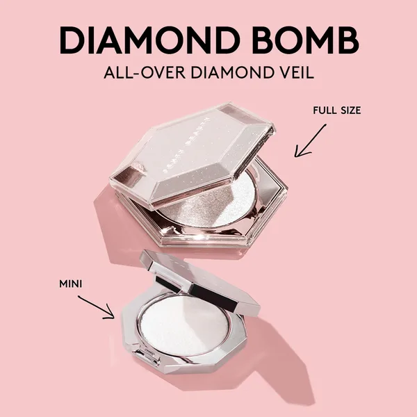
“ALL-OVER DIAMOND VEIL”
Why it works
A large silver faceted compact sits at the upper right of a pink ground, tagged "FULL SIZE" with an arrow, and a smaller twin sits at the lower left, tagged "MINI". The comparison is the product against itself in two sizes, which answers a how-big-is-it question at a glance. "DIAMOND BOMB" is the headline and "ALL-OVER DIAMOND VEIL" the descriptor, so the sparkle is left to the picture.
Started 2 Sep 2026. Live when checked on 25 Oct 2026. View in Meta Ad Library ↗
The parts of the ad
- 01
Comparison. In 20 of 26 ads on this page.
- 02
Lifestyle scene. In 6 of 26 ads on this page.
- 03
Packaging. In 6 of 26 ads on this page.
- 04
Arrows and callouts. In 4 of 26 ads on this page.
- 05
Person. In 4 of 26 ads on this page.
Headlines that state the gap without naming a rival
Lifted from the ads above. Swap in your own product.
- 01Their [product] is mostly [problem]. Ours isn't.Humble Brands, “Their shampoo is mostly water. Ours isn't.”, 20 days
- 02The same [product]. A [fraction] of the price.The Cumin Club, “The same Palak Paneer. A third of the price.”, 100 days
- 03Most [category] [flaw]. [Product] [fix].Bon Charge, “Most skincare sits on top.”, 128 days
- 04Your other [thing] had a good run.Negative Underwear, “Your other loungewear had a good run.”, 59 days
Make the gap checkable at a glance
- Pick the losing side firstDecide whether the other side is a category, a price, a habit, your own past or your own range before you write a line, as Casper chose its own range and Bellroy its own past.
- Label it plainly and genericallyStep One writes "REGULAR BOXERS" and Nanoleaf writes "Typical Floor Lamp", so the viewer recognizes the other side without the ad accusing a company.
- Put the gap where the eye landsA heat map, two lamps in one room or a slim column against a shaded one lets the viewer see the difference before reading a word.
- Print one number the viewer can checkPaper Shoot puts "27 shots" beside "30,000+ shots" and The Cumin Club prints "$5.99" beside "$18.99", each a gap a buyer can verify in a second.
- Keep the verdict to one sentenceHumble Brands needs only "Their shampoo is mostly water. Ours isn't." and lets the bars in the tin answer it.
- Hold the offer until afterThe Cumin Club shows the price gap first and lets "FIRST BOX 20% OFF" close the frame as a last banner.
Sizes and Safe Zones are on our Instagram Safe Zone checker page.
Naming the other side
Name a rival only when you can back the claim. A comparison that names a company is a claim about that company, so the proof has to be ready first. Most ads here avoid the question by labelling the other side with a type of product.
Black it out when you would rather not. Shay and Blue sets a solid black silhouette beside its lilac bottle, so each viewer supplies their own designer name and the ad names none.
Use a category label for everything else. Most of these ads write "OTHER BRANDS", "REGULAR BOXERS", "Typical Floor Lamp" or "China Dropshipping" over the losing side, which is a type of product or route, not a company.
What the FTC says. The FTC's policy statement on comparative advertising treats truthful comparisons that name a competitor as useful to consumers, and the claims in them still need backing.
Source: ecfr.gov
Printing the gap
A measurement. Nanoleaf prints "19cm" and "35cm" under its two lamps, so the claim about space is something a buyer could check with a tape measure.
A count. Paper Shoot sets "27 shots" against "30,000+ shots", and Anyday writes "10 functions = 1 dish", each a number the viewer can see on the picture.
A price. The Cumin Club prints "$18.99" and "$5.99" on the same frame, so the gap is shown as well as stated, while Shay and Blue states it as a quarter of the price.
A visible effect. Step One shows a thermal image, blue beside red, instead of the word cooler. Meta's Advertising Standards ask for claims that are true, so a gap you can show is the safest one to print.
Source: transparency.meta.com
Naming a rival: the questions that come up
Can a comparison ad name a competitor?
Yes, the FTC's policy treats truthful comparisons that name a competitor as acceptable, as long as the claims are accurate and can be backed up. The ads here mostly write labels such as "OTHER BRANDS" or "Typical Floor Lamp", and Shay and Blue blacks out the bottle it measures against.
What makes a comparison ad believable in a feed?
A gap the viewer can check with their own eyes or a number printed beside it. Nanoleaf prints "19cm" against "35cm" under two lamps, Paper Shoot puts "27 shots" beside "30,000+ shots", and Step One shows a heat map in place of an adjective.
How do you compare a product that has no obvious rival?
Compare it with the buyer's habit or with itself. The Cumin Club sets takeout at "$18.99" beside its own "$5.99", and Bellroy sets a new wallet beside the same wallet at "DAY 1000", with no competitor in either frame.
Does a comparison ad need a split layout?
No, though many of these ads use one because both sides are easiest to judge at once. Bon Charge, Humble Brands and Thesis keep the rival in a line of text and show only their own product.
How do I look up competitor ads?
Search the brand in Meta's Ad Library, which is public and free. Each ad shows its start date, so you can tell which have run the longest and study how those set up the other side.
Make comparison ads like these
A comparison ad is won or lost on who sits on the losing side, so bring your client's website or your own and we will build ads that give your product a checkable other side.
How we pick ads. We search Meta's public Ad Library for ads from DTC brands that sell to US and UK shoppers, keep ads running 14 days or more, skip catalogue ads, and show at most 3 per brand. Days running is a spend signal: brands rarely keep paying for an ad that doesn't sell. Day counts are as of the check date above. Breakdowns are written by Gimme Gimme's ad analysis engine from each ad's image and copy, and edited by Josh Jackson, founder. Not affiliated with the brands shown; ads appear for commentary and analysis. To have an ad removed, email hello@getgimmegimme.com and we'll take it down within 7 days.